Client
DriveAppa
Project
Website
Type
Webdesign, Digital Design, Text
What if urban mobility wasn’t just a necessity, but a seamless extension of our way of life? What if technology wasn’t just a means of getting around, but an intuitive companion moving to the rhythm of the city? What if a brand didn’t just offer a service, but sparked a movement — a new way of moving? These questions formed the foundation of our work for Appa, a new e-scooter sharing provider. In a sector dominated by functionality, we aimed to create an identity that goes beyond being a platform: an invitation to move through urban space in a new way.
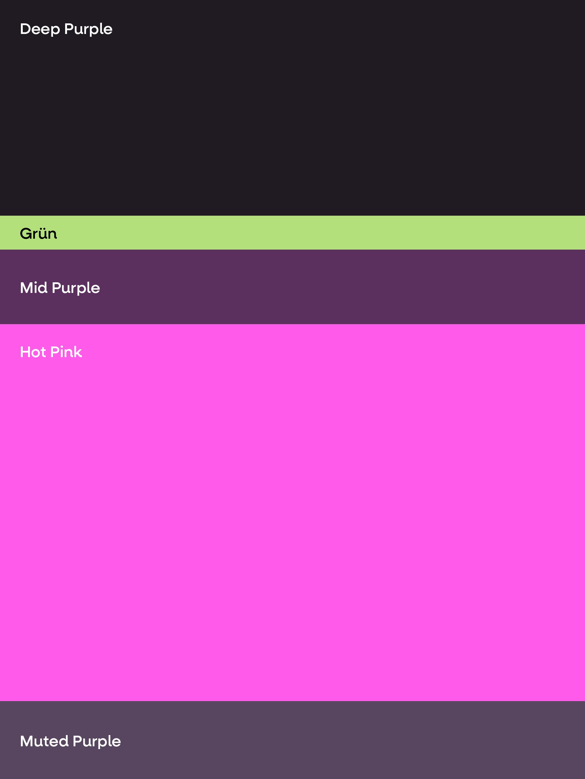
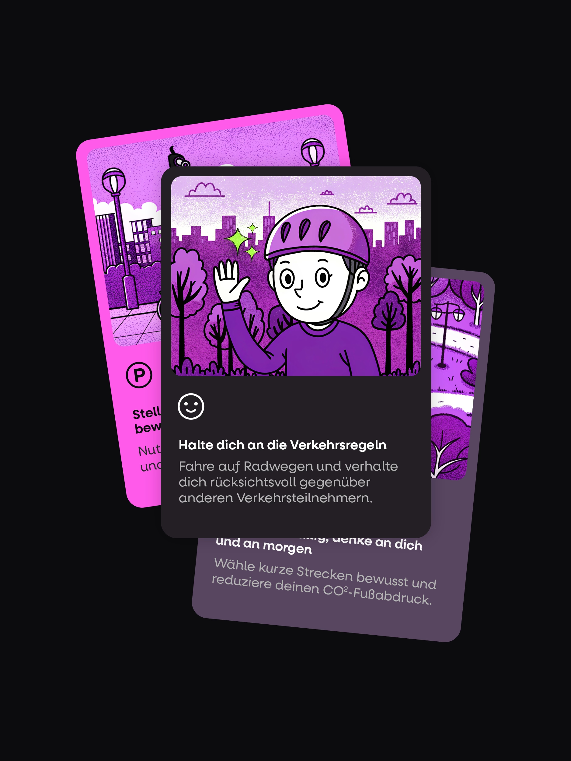
Appa represents a mobility experience that is simple, effortless, and fluid — and the design had to reflect exactly that feeling. Inspired by the dynamics of the city, we developed a visual identity that doesn’t just depict movement but embodies it. Reduction wasn’t an end in itself, but a tool for clarity. A clean, geometric wordmark conveys both precision and lightness. The typography combines functionality with character: objective, yet with a distinctive voice. The color palette merges urban coolness with vivid accents, reflecting the pulse of city life. Movement is not only found in the architecture of the city but also in how people navigate it — a relationship echoed in the imagery. Instead of static scenes, the photography captures transitions, interactions, and the sensation of merging with the city.
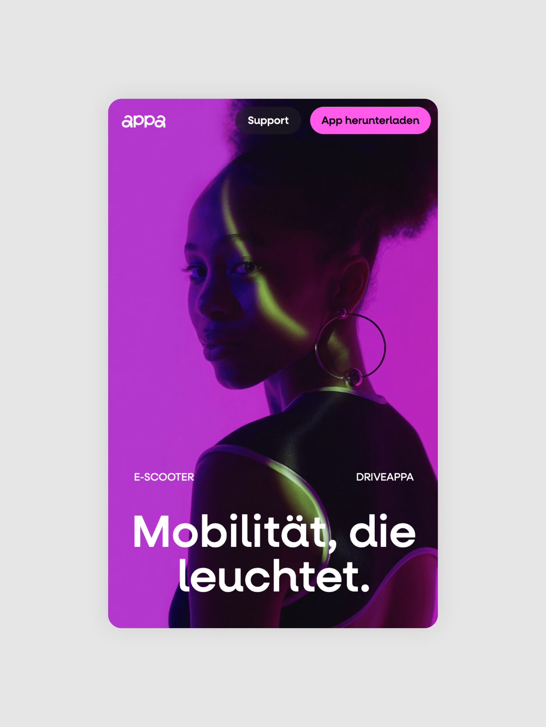
Appa exists at the intersection of digital service and physical experience. This duality is reflected in the design of the digital platform: a reduced, intuitive navigation system provides instant access to information, without distraction, without friction. Interactive elements and subtle animations enhance the feeling of flow, a dive into motion that never stands still. Negative space is used deliberately as a design statement, not as emptiness, but as a tool for orientation, clarity, and conscious pauses in the visual rhythm.
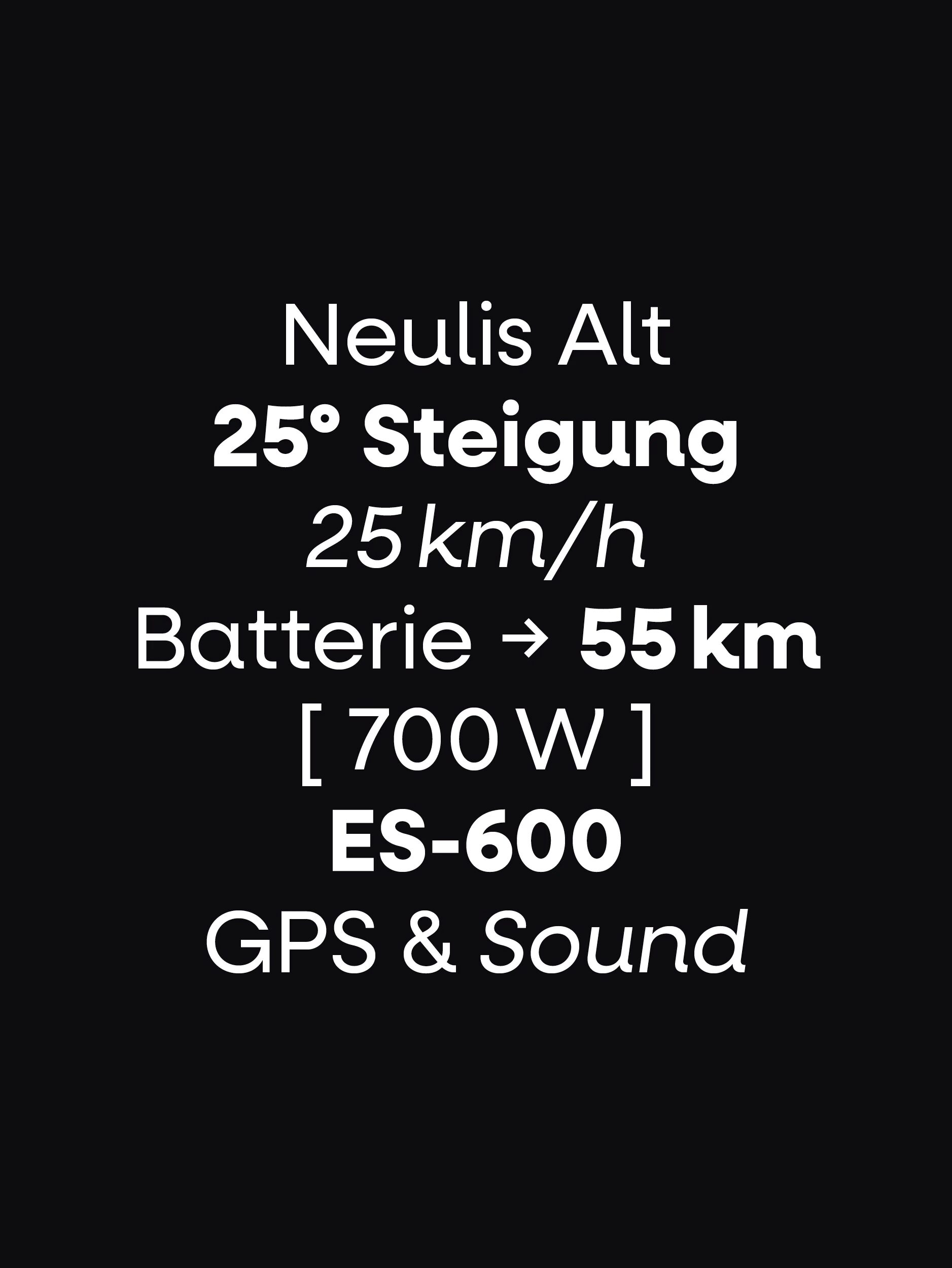
The way we speak about mobility shapes how we experience it. Appa’s language is direct but never cold. It inspires without exaggeration. It is clear but never distant. This is not just about transportation, but about freedom. Not just efficiency, but experiencing the city. Not just technology, but connecting people with their surroundings. This balance of precision and emotion runs throughout all communication — from microcopy in the app to narrative elements on the website.
Appa is more than a platform for e-scooters. It’s a new way to move through the city — effortless, intuitive, fluid. The design makes this philosophy visible: an identity that doesn’t impose but creates space. A design that doesn’t just appeal visually but conveys a feeling of lightness. A language that doesn’t just describe but prompts action. Because true mobility doesn’t begin with a vehicle, it begins with a vision.
